ScriptScape
Product Design & Brand
A node-based tool that turns a motion design script into client-ready storyboard frames — co-founded and design-led. Full-stack design work across concept, prototype, Figma UI, Framer landing page, and Blender brand animation.
The Brief
ScriptScape started as a question: why does the pre-production phase of a motion design project still happen inside a Google Doc?
I co-founded it as the design lead. The idea came from watching the same friction repeat across every explainer project — a script lands, you mentally chop it into scenes, sketch visual directions in your head, and then try to get a client to picture something they can't see yet. The whole conversation happens in the wrong medium.
ScriptScape was built to fix that. A node-based tool that takes a script, breaks it into beats, and lets you branch visual directions for each one — so by the time you're generating storyboards, the creative logic is already locked. The tagline: "Turn creative briefs into client-ready frames. Built for motion designers, by motion designers."
The Hierarchy
The core insight behind the product is that an explainer video is actually a hierarchy. A video breaks down into scenes. Scenes into frames. Frames into objects — characters, backgrounds, motion graphics, text overlays. Once you see it that way, the production process makes more sense as a tree than a list.
Video → Scenes → Frames → Objects (characters · backgrounds · motion graphics · text overlays)
The original concept centered on asset retrieval — reusing visual assets across scenes to keep things consistent and lean on an existing brand system. We pivoted away from leading with that. After talking to more people, it was clearer that the earlier bottleneck was the creative direction itself, not the assets. So we shifted focus: script to beats, beats to visual directions, visual directions to storyboards.
Text Before Storyboards
One of the more deliberate product decisions was putting visual direction before storyboard generation — not to add a step, but to cut cost.
Generating accurate storyboards directly from a script was expensive at the time. Text descriptions, on the other hand, are fast and nearly free to generate. So the flow became: lock the direction in text first, then generate imagery. You're only rendering the frames you've already committed to. It's the same logic that makes a strong brief cheaper than a round of revisions.
Prototype First
Before anything went into Figma, I prototyped the canvas in Google AI Studio's build tool. I wanted to know if the node-based interaction model actually worked — whether branching directions, selecting alternatives, and seeing the pipeline laid out felt intuitive — before I designed a single component.
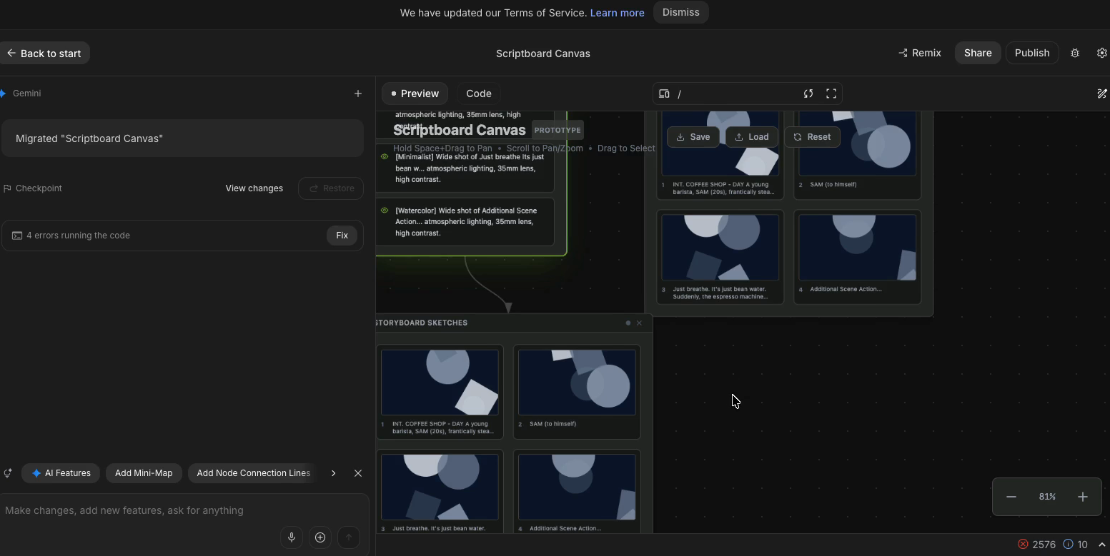 The early node-based canvas prototype built in Google AI Studio: segments that branch into visual ideas, each branching further into sketch/storyboard variants.
It did. The prototype had real interactivity: segments that branch into visual directions, each one branching further into storyboard variants. Once I had that validated, I took the skeleton into Figma and started shaping the identity that the UI would sit on top of.
The Brand
The brand intro was built in Blender — a 3D animation of the ScriptScape logo and wordmark. The diagonal-strokes mark lent itself well to a motion treatment, so I built it as a proper brand-intro sequence rather than a static lockup.
The branding itself is dark, technical, precise — which fits the tool's audience. Motion designers aren't a soft-sell crowd.
The App Design
The Figma work was probably the most thorough product design I'd done at the time. Tokenized components, hover states, the node canvas with a grid-dot background, the "+" affordance to extend branches, prompt-editing fields. The primary flow shows a script input breaking into generated segments, each with two visual direction variants — a detailed color style frame and a wireframe storyboard, side by side.
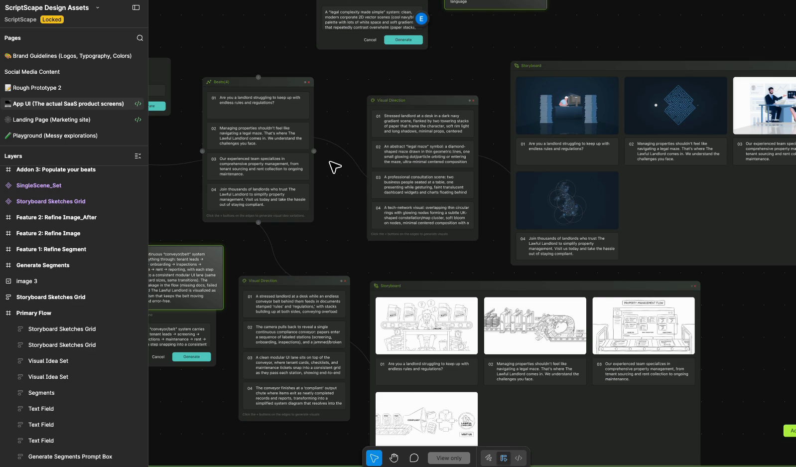 The primary flow on the node canvas: script input → generated segments → branching visual directions. Two variants per beat — a detailed color style frame and a wireframe storyboard — on a grid-dot canvas.
The interaction model was specified down to the button hover demo and generating-segments animation. Not just how it looks, but how it behaves.
The Landing Page
The site was designed and built in Framer — multi-page, responsive, desktop through phone. The whole thing runs on a shared design system, with a page component holding the nav and footer so nothing drifts across pages.
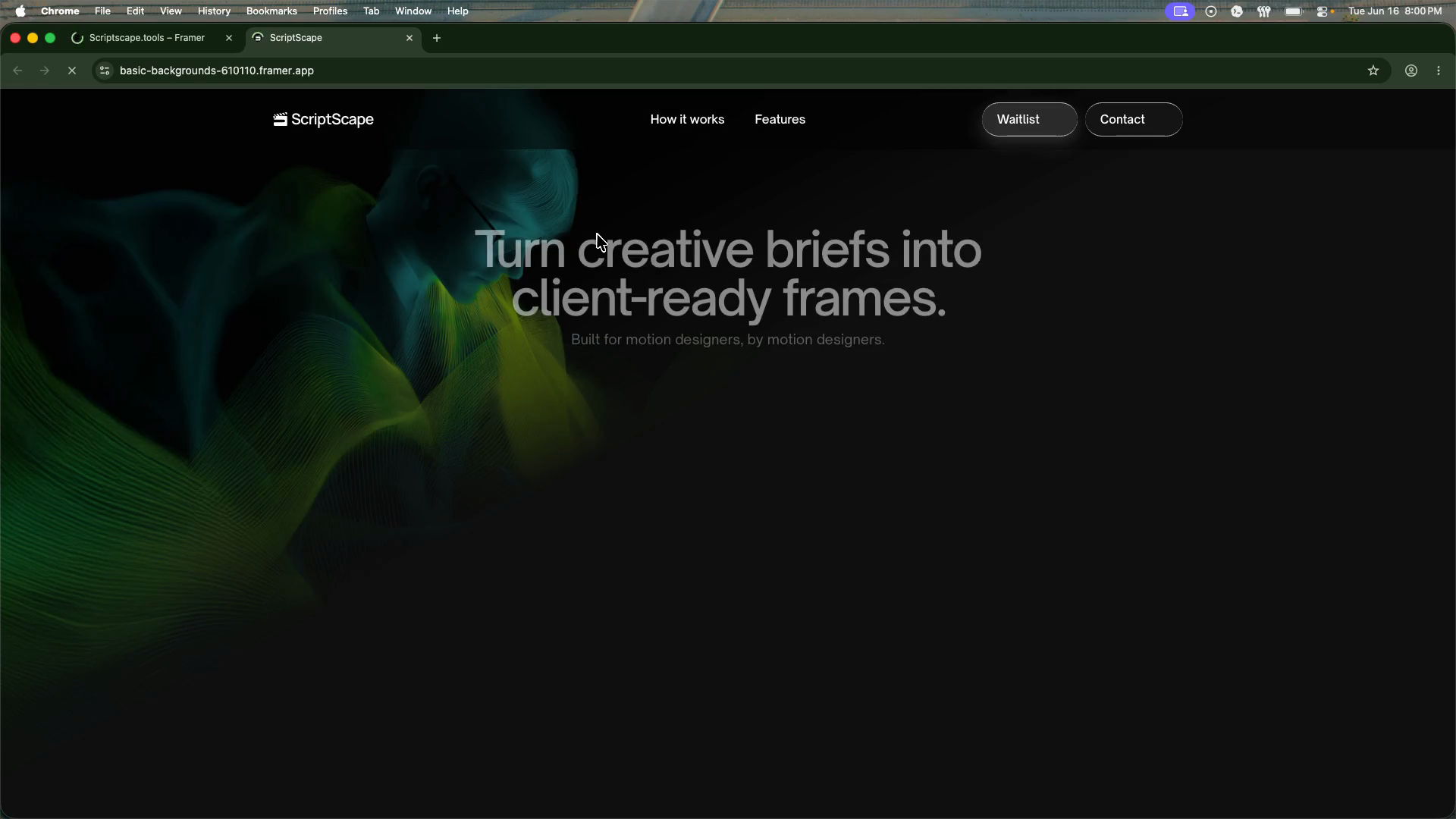 scriptscape.tools hero — "Turn creative briefs into client-ready frames. Built for motion designers, by motion designers." Dark theme, animated abstract background.
The Framer project for scriptscape.tools — full multi-page site (Home, Features, FAQ, and more), all running on a shared design system with tokenized components. Each page inherits the nav and footer from a single shared component so layout stays consistent across breakpoints.
The design-to-build pipeline was intentional: copy drafted in Notion first so the structure was solid before anything landed in Framer. That meant by the time I was placing content, the hierarchy was already right — no retrofitting copy around layout constraints.
A few details worth naming: the FAQ section has a plus-to-minus rotation micro-interaction on toggle. The hero carries an animated abstract background. The "How it works" section bakes the product's node diagram directly into the page, so the concept is visual from line one. The Framer component tree used tokenized values throughout, which made color and type updates global rather than manual.
The Product Demo
Watch the Product Demo on Vimeo →
The product demo was a full-stack production effort — filmed, narrated, motion-graphics-assisted, and edited together into a 3-minute deliverable that shows the tool end-to-end.
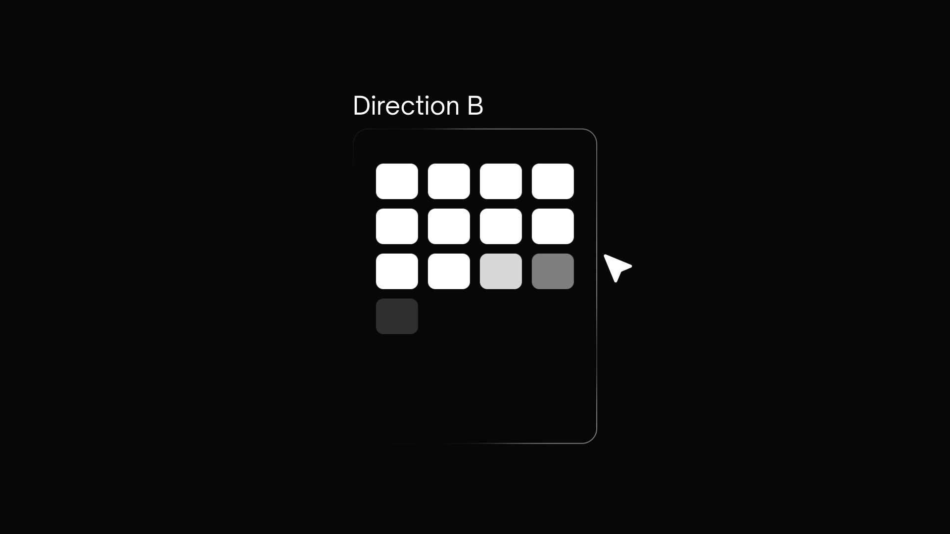 The demo opens on an animated motion graphic — storyboard "Direction" cards floating over a fluid dark background. This isn't just aesthetic; it's showing the product's core output before the app is even on screen.
The structure: intro motion graphic → talking head explanation → live app walkthrough → outro. The motion graphic at the top was built separately as an explainer asset, then edited into the demo as the hook. It visualizes what the tool produces — multiple visual direction options, labeled A, B, C — which sets up the app demo before you see a single UI element.
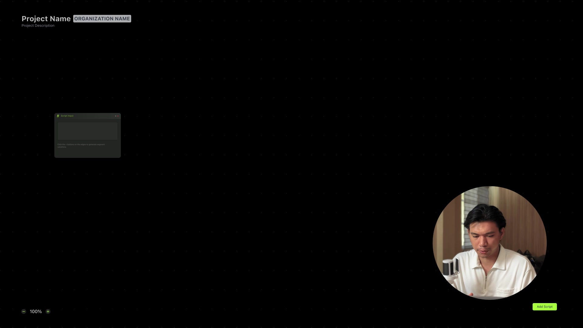 The live app in the demo. Dark canvas with grid-dot background, the Script Input node in view, and a talking head PiP in the corner. The canvas is sparse here intentionally — showing the starting state before any generation.
The live demo uses "The Lawful Landlord" as the example project — a real explainer script about property management. That choice matters: it's a concrete use case, not a placeholder, so the generated beats and visual directions read as real output rather than demo data.
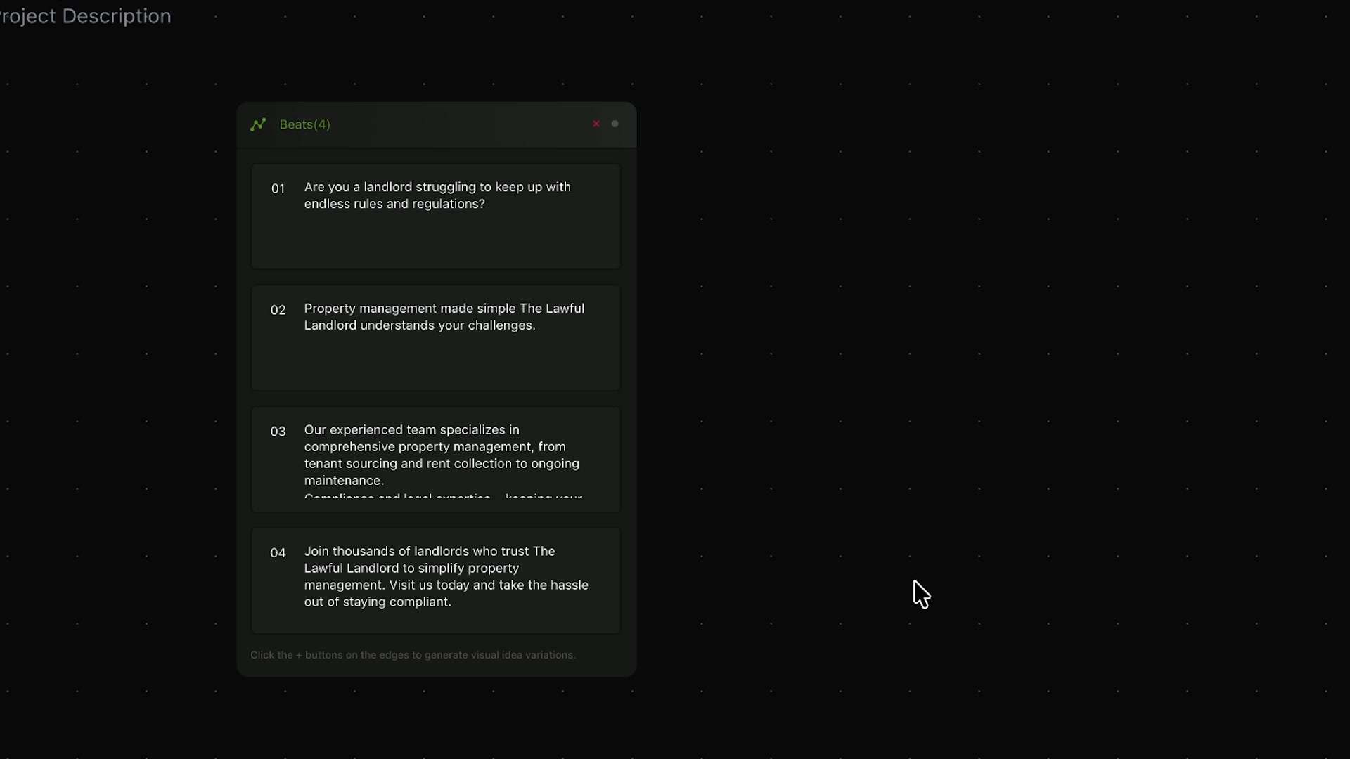 The Beats(4) node — the script broken into four sequential beats, numbered and readable. Each beat is a node the designer can extend into visual directions.
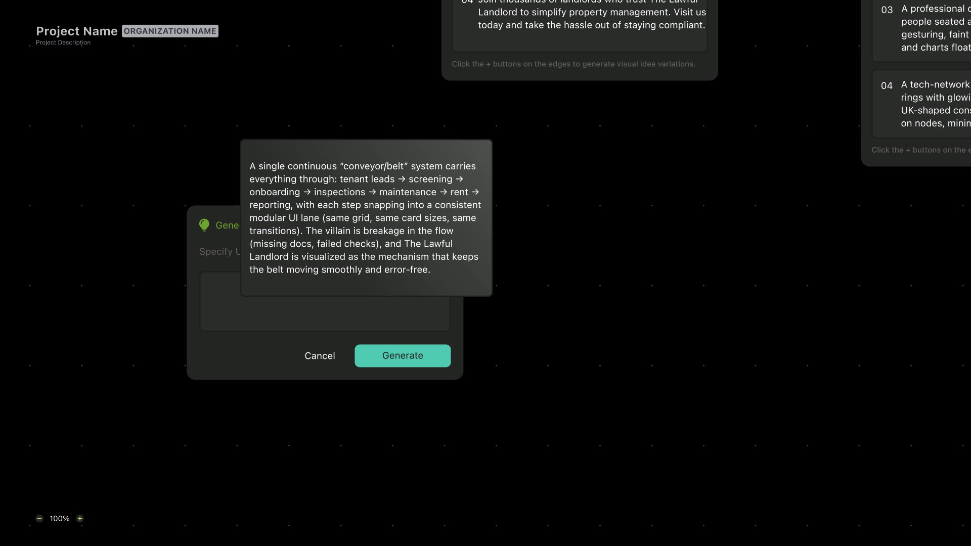 The Generate dialog for a visual direction — AI-generated description of a storyboard concept for one beat. In this case: a conveyor belt metaphor visualizing the full property management pipeline.
I filmed the talking head segments myself, edited the whole video in Premiere Pro, and composited the motion graphic layer in After Effects. The PiP layout — talking head in the corner while the app is visible — was a deliberate framing choice to keep both the human explanation and the UI visible at the same time.
The demo closes on a black card: scriptscape.tools. No clutter.
What Happened
Honest answer: the business side didn't work. After about three months with no revenue and a tight budget between me and the co-founders, we paused it. Around six waitlist signups.
The product concept is still solid. The pivot points were right, the design system is clean, and the tech landscape has shifted enough that revisiting it makes more sense now than it did when we paused. The design work is real regardless of what happened after.
My Contribution
| Area | What I did |
|---|---|
| Product concept | Originated the video→scenes→frames→objects hierarchy; founded the node/branching model |
| Product strategy | Drove the pivot from asset retrieval to script → beats → directions → storyboards |
| Prototyping | Validated the canvas in Google AI Studio before committing to build |
| App UX/UI | Full Figma design system — node canvas, primary flow, tokenized components, interaction demos |
| Landing page | Designed and built scriptscape.tools in Framer, multi-page, responsive, design-system-driven |
| Brand | Visual identity, color, typography, plus a Blender 3D brand-intro animation |
| Content | Filmed talking-head segments, built a motion graphic explainer, edited the product demo in Premiere Pro, composited in After Effects |
Credits
ScriptScape was also shaped by Lyle Kenneth Geraldez and Paul Fuentes, who came in as co-founders and developers and helped a great deal with planning and keeping the build moving smoothly.
Lyle's backend work in particular was exceptional, and it made a real difference in how solid and dependable the project felt while we were developing it.